Make the Office 365 P1 Plan Footer Stick to the Bottom of the Page
This post is over a year old, some of this information may be out of date.
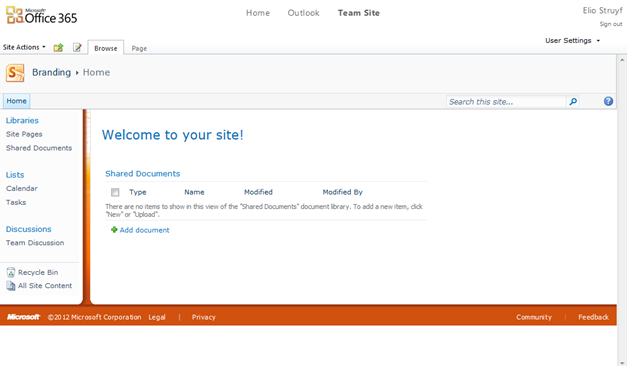
People that are using the Office 365 P1 Plan they probably already noticed that the footer does not stick at the bottom of the page. But I do not like the empty white space at the bottom, so I thought to fill it up and make the footer stick to the bottom of the page.
Here is how it looks out-of-the-box:

In the past I have already created a sticky footer solution for SharePoint which can be found here.
For the Office 365 layout, you will need to follow the next steps.
Step 1
Open the site in SharePoint Designer 2010.
Step 2
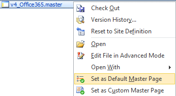
Create a copy of the v4.master page and set it as default and custom master page.

Step 3
Find the s4-workspace DIV and add the following line underneath it:
<div class='wrapper'>Find the closing tag of the s4-workspace DIV, and close the wrapper DIV.
Step 4
Find the DeveloperDashboard control, and add the following line underneath it:
<div class='push s4-notdlg'></div>Step 5
Add the following CSS to the master page or custom stylesheet.
body { overflow: hidden !important;}html.ms-dialog body { /* Show the vertical scrollbar only when needed in the dialog forms. */ overflow-y: visible;}.wrapper { min-height: 100%; height: auto !important; height: 100%; /* The bottom margin is the negative value of the footer's height */ margin: 0 auto -30px; overflow: visible !important;}.ShellFooter, .push { /* .push must be the same height as .footer */ /* Multicolumn Layout With Sticky Footer */ clear: both;}/* Set the dialog overlay to 100% width and Height. Otherwise the page body will show scrollbars. */.ms-dlgOverlay { height: 100% !important; width: 100% !important;}body #s4-workspace { margin-bottom: -30px; }
/* Orange Footer */body #s4-workspace { background: #D1510F; }#s4-titlerow { position: relative; z-index: 2; }#s4-mainarea { background: #fff; }.divider { z-index: 1; }Result
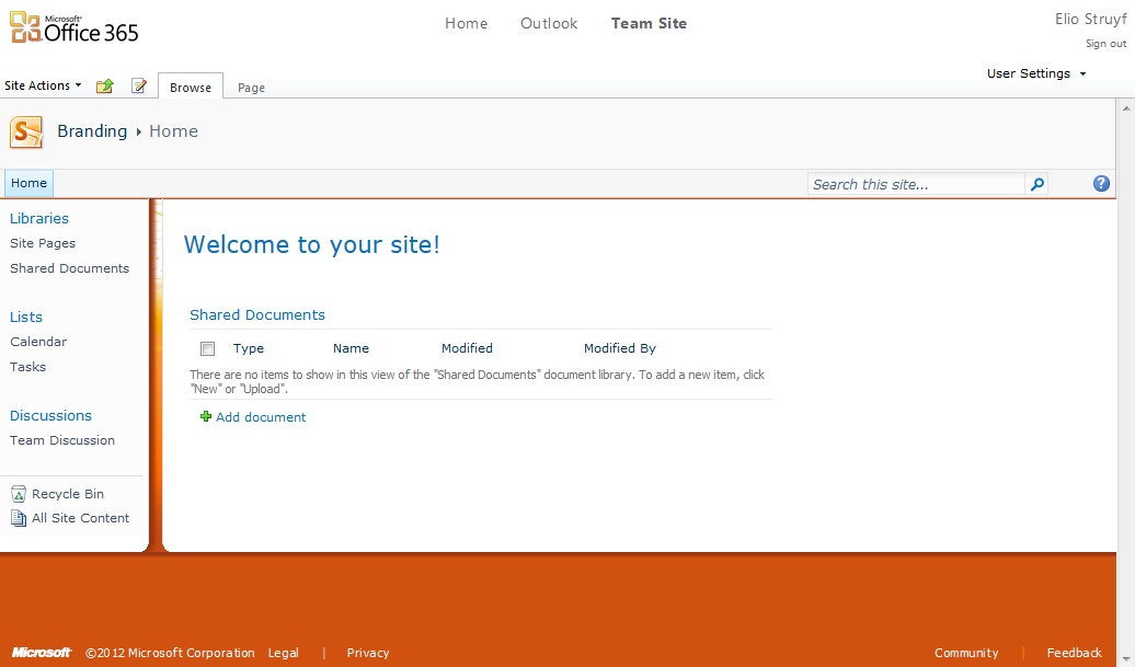
The end result looks like this:

Related articles
Report issues or make changes on GitHub
Found a typo or issue in this article? Visit the GitHub repository to make changes or submit a bug report.
Comments
Let's build together
Manage content in VS Code
Present from VS Code
Engage with your audience throughout the event lifecycle
