Redesign of my blog with Tailwind
This post is over a year old, some of this information may be out of date.
Since the beginning of 2013, I have been using the same blog theme with a couple of small changes that I did over the years. Most of the time, I would change the primary colors, but that was all. Why would you change something which works fine?
When I moved from WordPress to a static site, at first, I thought it would be an excellent time to redo the design, but the migration took a bit longer, so I just ported the design to Hugo.
A couple of weeks ago, I started reading more about Tailwind CSS. There are many people making noise about it, so it got my attention as I learn new technologies, frameworks, or tools by creating use cases for them and start implementing. I wanted to give it a try to make myself a new design.
After seven years, my blog finally has a new design, which is, in my opinion, lighter, cleaner, and minimal.
Changes to the design
As changing the design is also an excellent time to get rid of some old code, I could finally get rid of a very old jQuery and AngularJS app/version.
jQuery was still a big thing when I started using the theme. I used it for the mobile menu and some other functionalities.
I used AngularJS for my custom search experience in combination with Azure Search.
In the new theme, I wrote everything from scratch with TypeScript and React. I only use React for the custom search experience.
Website theme over the years
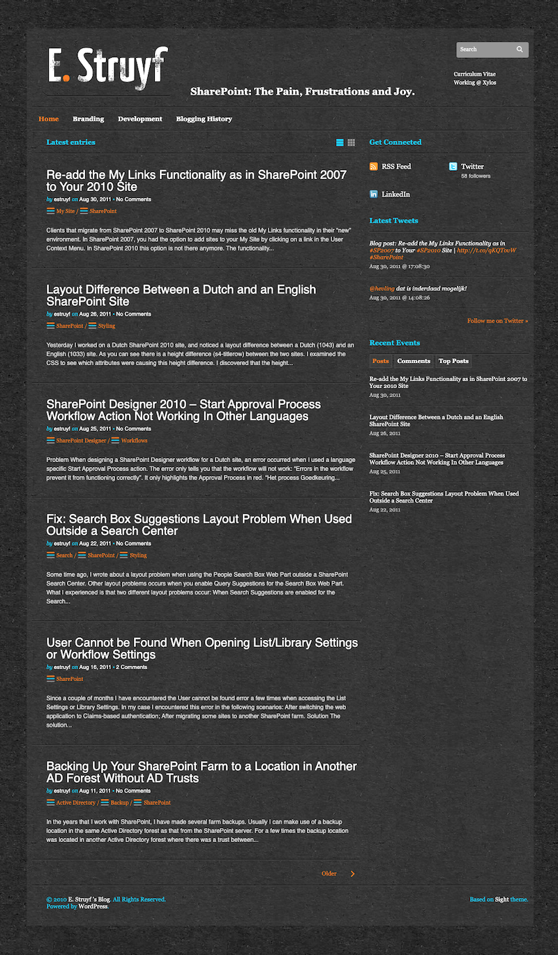
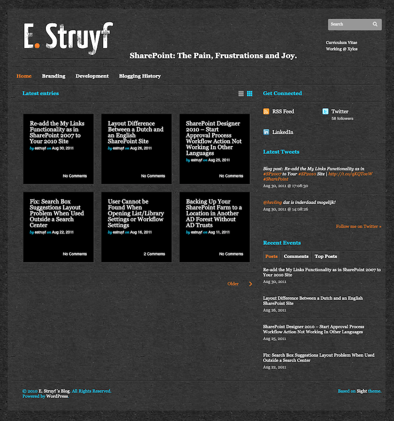
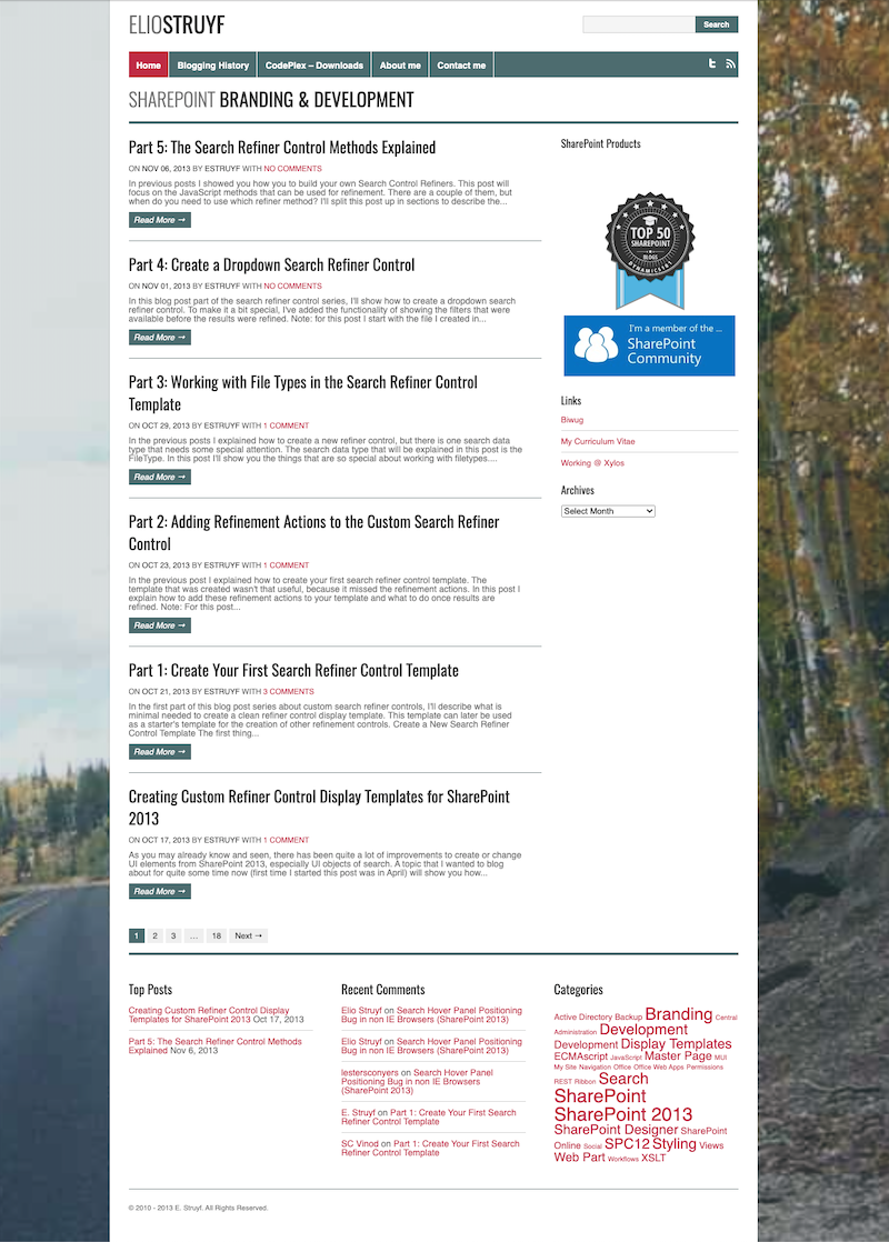
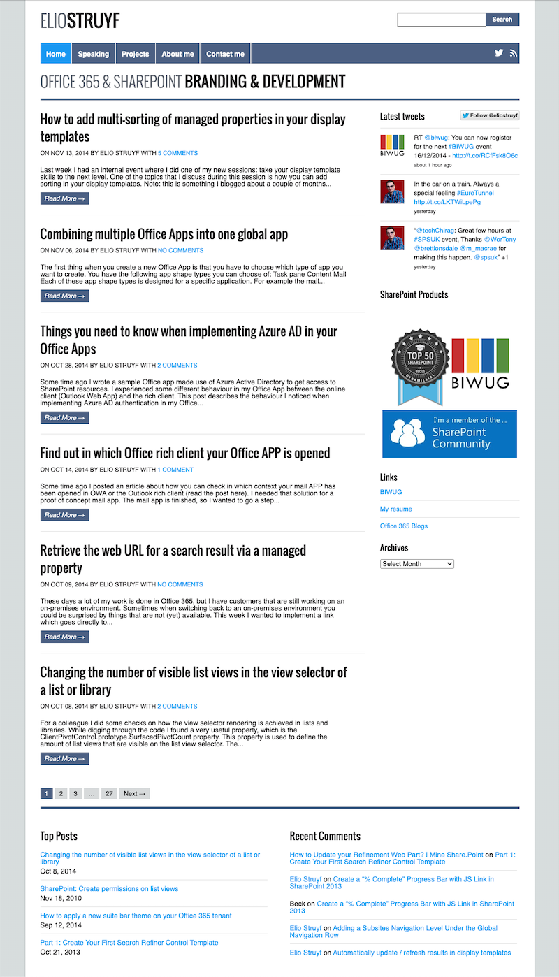
Here are a couple of screenshots of the history of the theme on my blog.
2011
2013
2014
2016
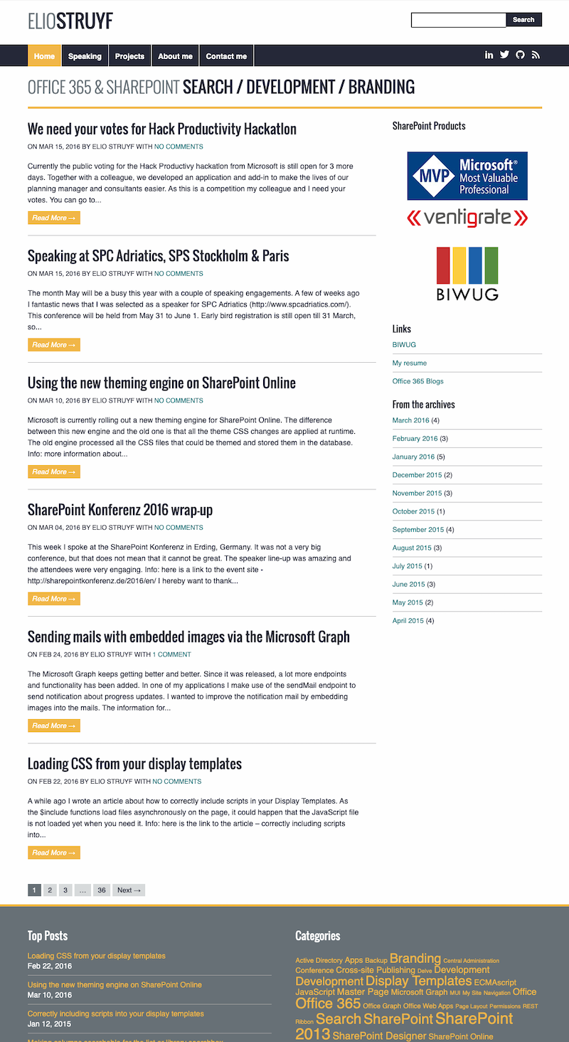
2017
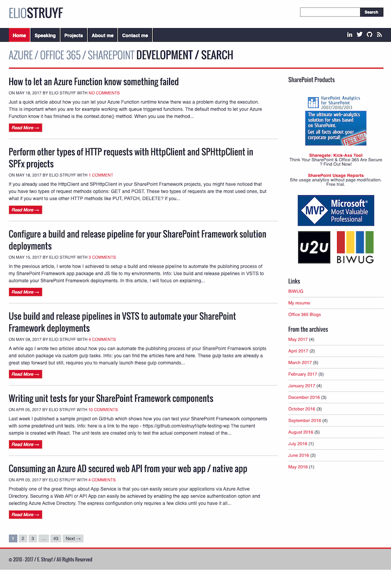
2018
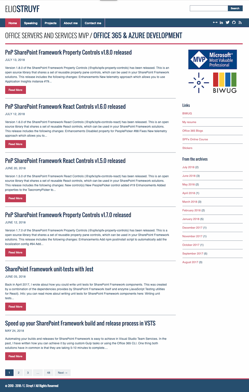
2019
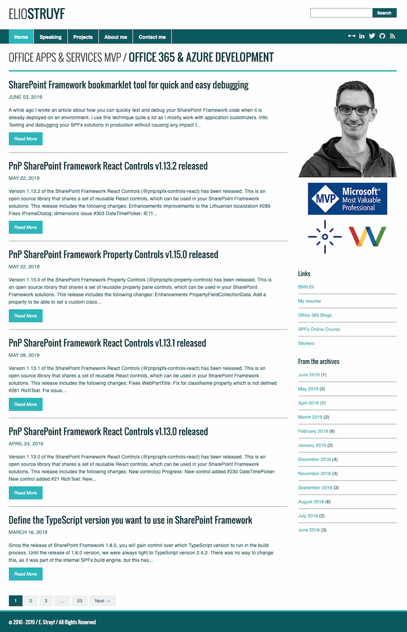
2020
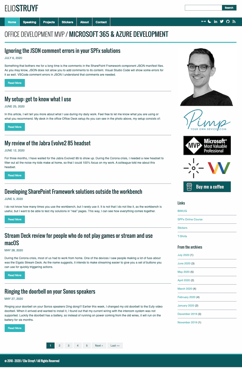
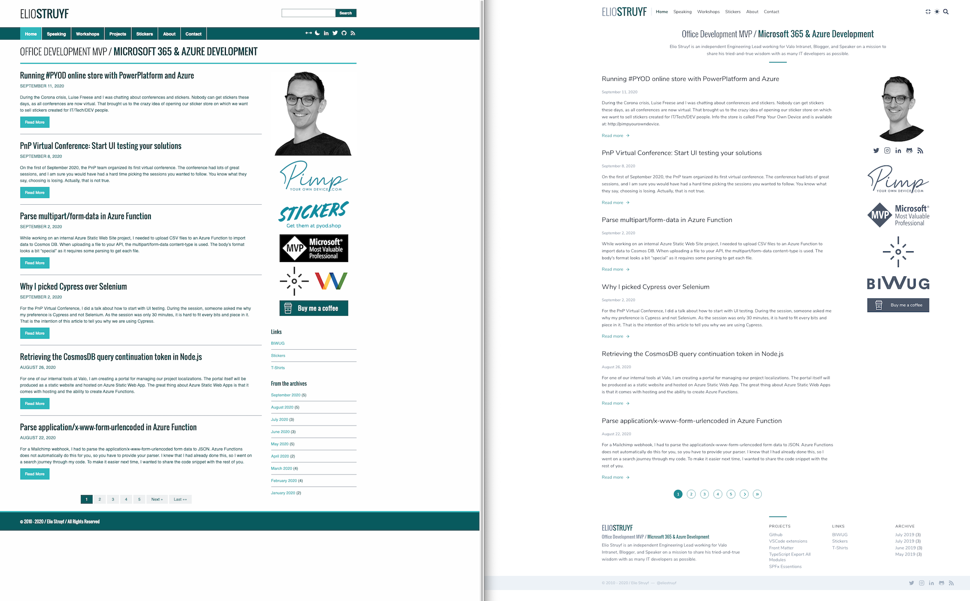
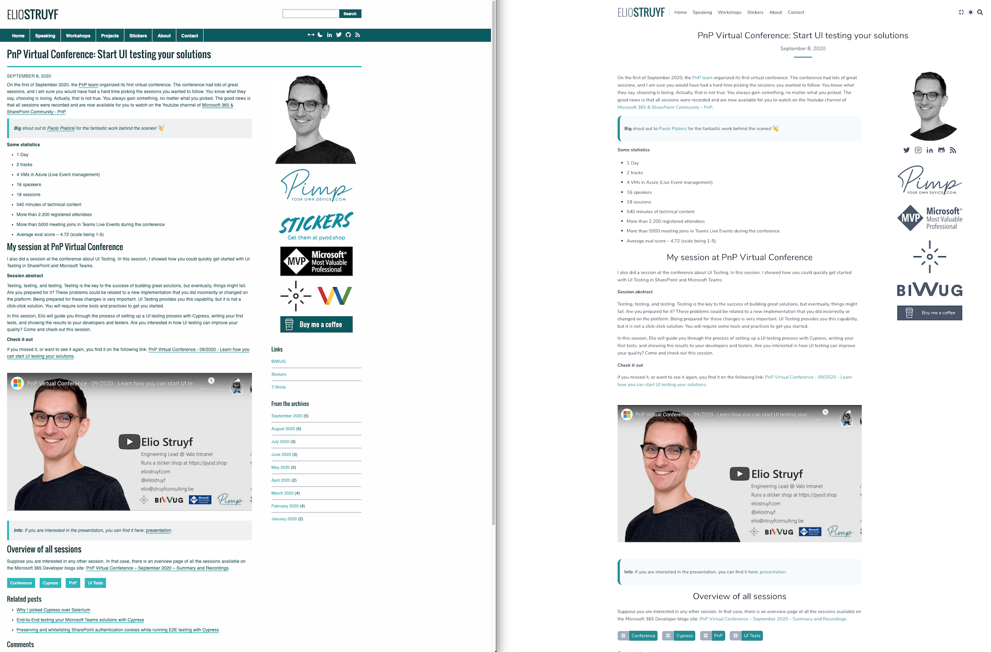
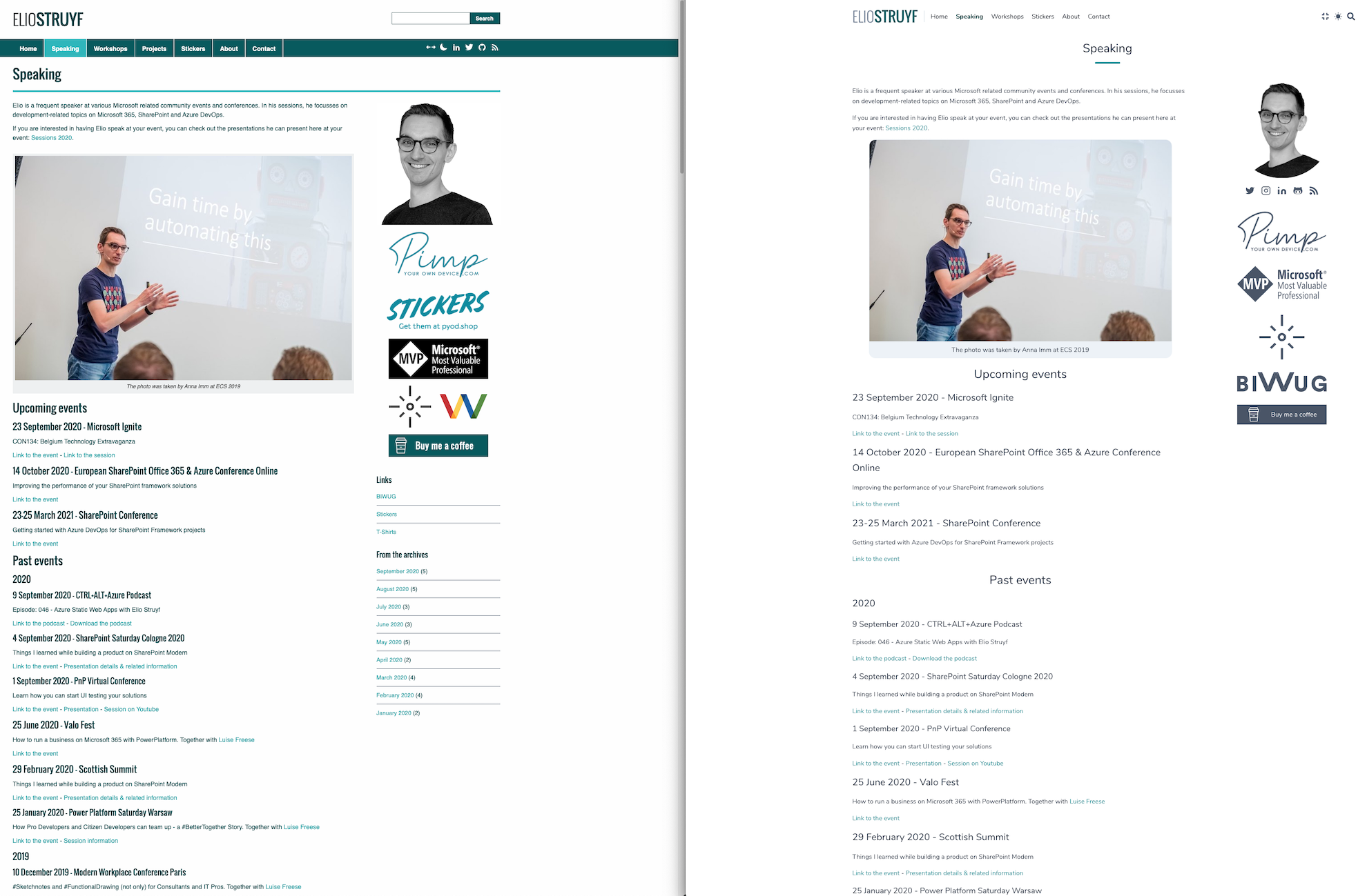
Comparison
Nothing is better than a comparison side by side. That makes it easier to see all the differences.
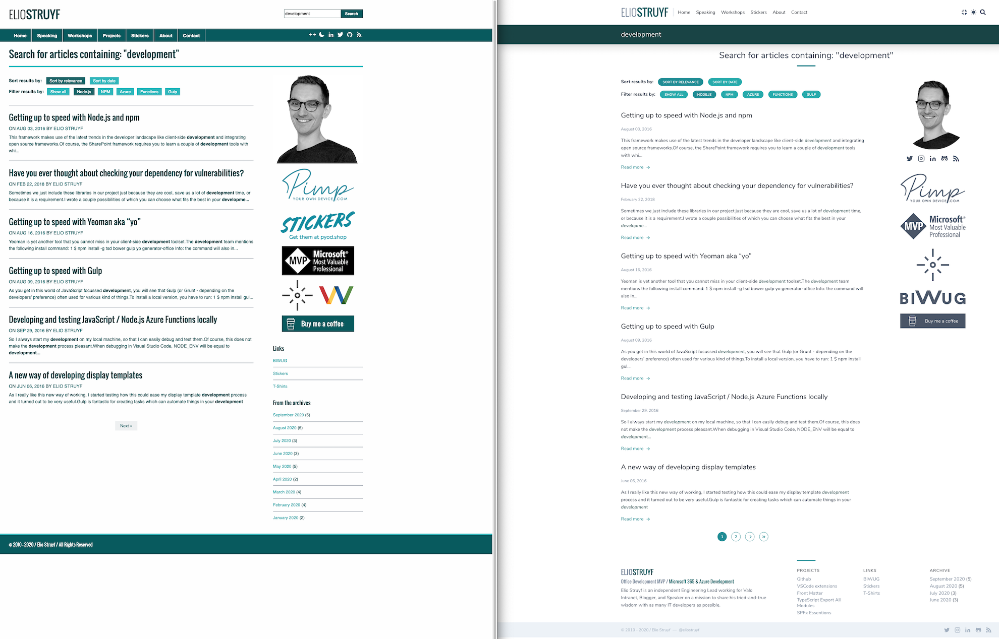
Something about Tailwind
Tailwind is a utility-first CSS framework. Which allows you to write less CSS, but more CSS classes in HTML. At first, this feels a bit weird, but it is very powerful.
The most significant difference is that the framework does not have any predesigned components like most other frameworks. Using this framework means you have total freedom and control over your design and might make it harder to start.
My first experiences were good, but the HTML tags can quickly get overloaded with CSS class names. Luckily you can also add CSS the regular way and reuse the CSS from Tailwind with @apply and specifying the class name.
Feedback
If you spot an issue or have feedback on the theme, feel free to provide it, the comments are open.
Related articles
A code-driven approach to theme your VS Code webview
In this article, Elio shows a code-driven approach to theme your Visual Studio Code extension webviews.
How to Display the Site Title and Site URL in Search Results
List Of All font-family and font-size Attributes Used in SharePoint 2010 StyleSheets
Report issues or make changes on GitHub
Found a typo or issue in this article? Visit the GitHub repository to make changes or submit a bug report.
Comments
Let's build together
Manage content in VS Code
Present from VS Code
Engage with your audience throughout the event lifecycle
